Nextools
Nextools’ new identity: a masterclass in design simplification strategic approach.
BRIEF
Nextools developed 13 Shopify apps in just one year, they needed a unified brand and product identity that could streamline how merchants interacted with the tools. The goal was to reduce complexity across the board while maintaining the individuality of each app; ranging from small store solutions to enterprise-level tools.
SOLUTION
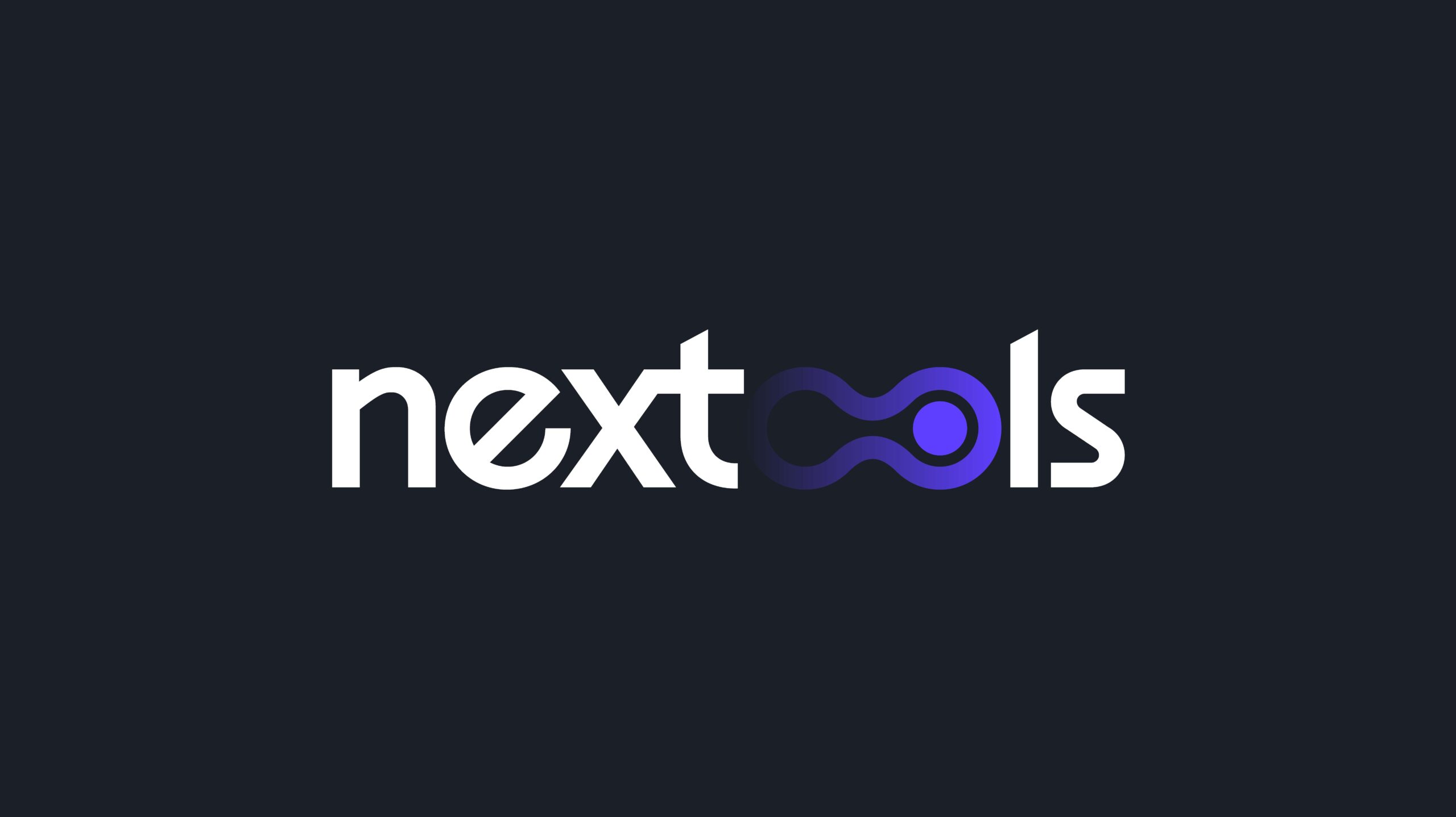
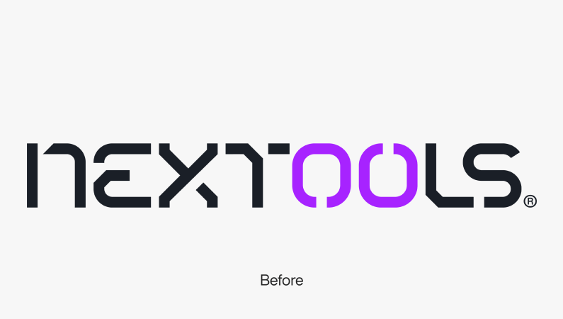
We developed a new logo and brand system built around the “Infinity Switch“. This symbol became the centerpiece of our rebranding effort, representing ease of use and simplicity in action. The fluid, continuous design of the logo visually communicates seamless functionality, which is central to our user experience philosophy.
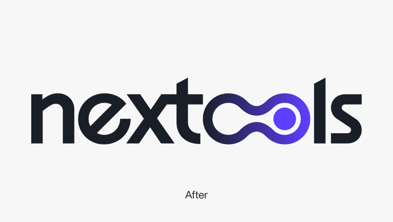
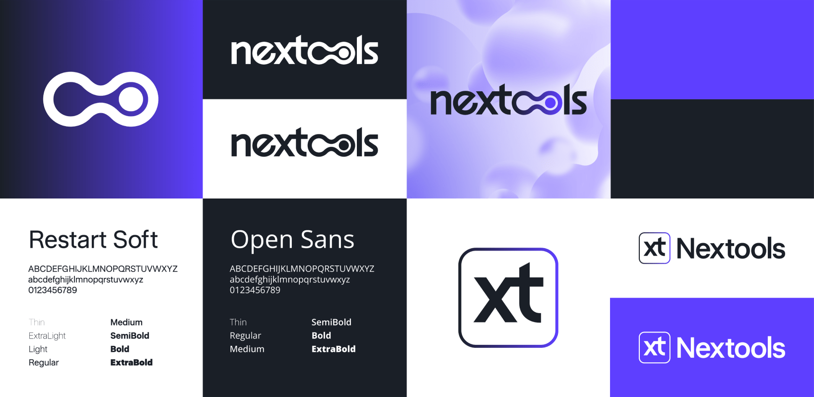
Simplifying complexity in a fast-growing product line.
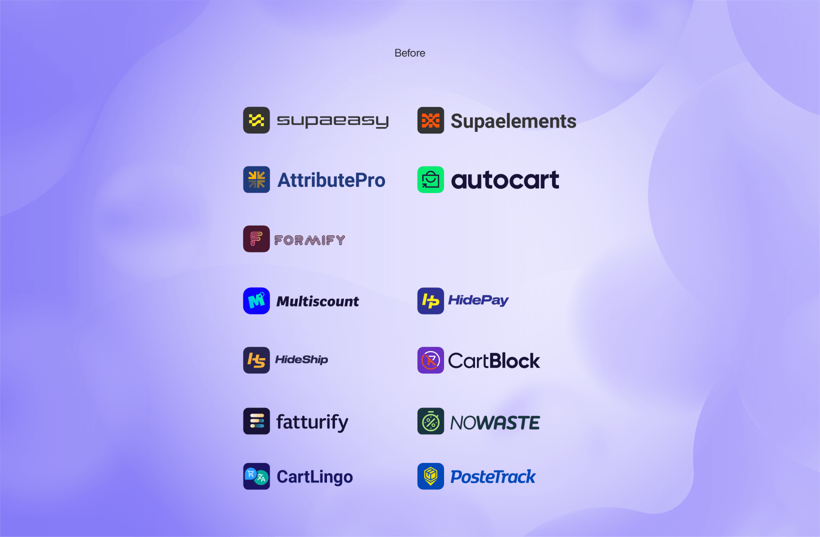
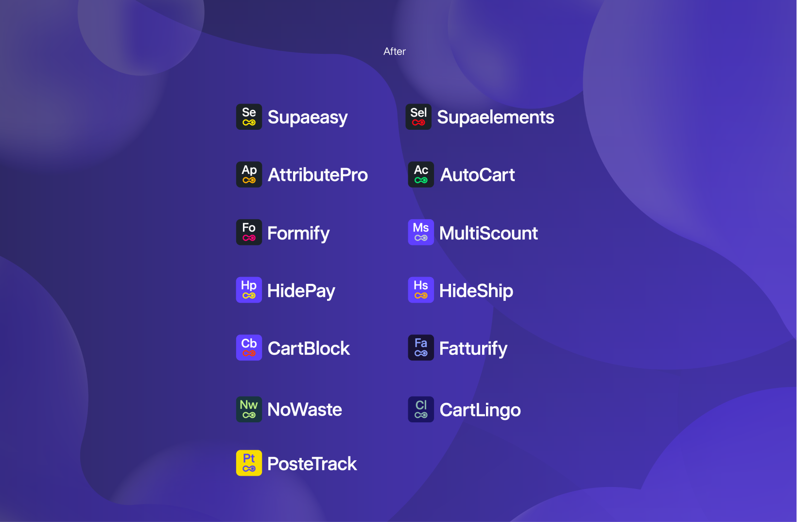
VISUAL CONSISTENCY ACROSS DIVERSE PRODUCTS
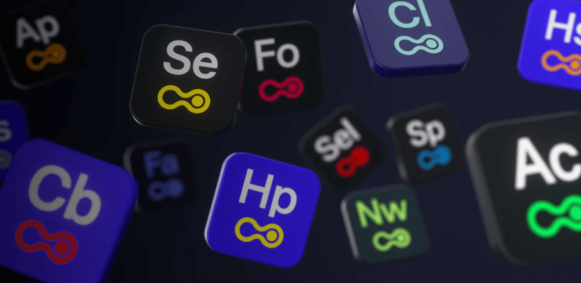
For the brand system we’ve chosen Restart Soft as the primary font and Open Sans for secondary text, ensuring a sleek and modern feel. We also refreshed the color palette, introducing Next Purple as a standout feature. For the app logos, we’ve implemented a distinct color scheme to clearly differentiate the main Suites, creating a cohesive yet versatile brand identity.
A NEW IDENTITY THAT REFLECTS GROWTH AND SIMPLICITY
The rebrand was crucial in a landscape where Nextools’ apps each had their own style and approach, creating inconsistency in branding and user experience. By unifying the design, we ensured a cohesive experience across all apps—streamlining everything from visuals and user interaction to support and billing. This alignment not only enhances recognition and trust but also simplifies how merchants engage with the tools, fostering a seamless and intuitive ecosystem.
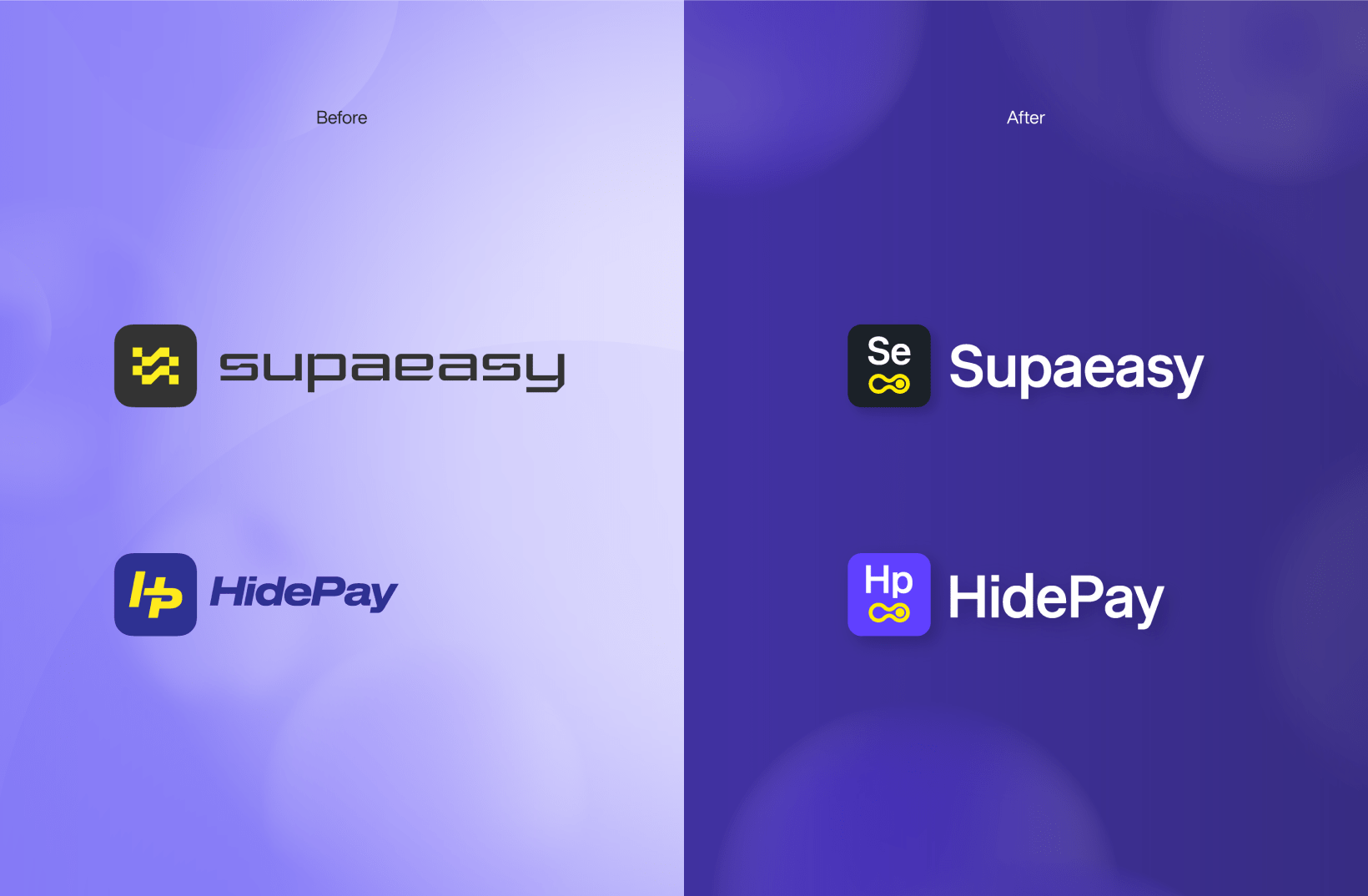
The “Infinity Switch” symbolizes endless simplicity, effortlessly connecting action to infinite possibilities.
VISUAL LANGUAGE FOR APP SEGMENTATION
To make app navigation smooth, we designed two distinct suites: the Starter Suite for small to mid-sized stores and the Pro Suite for larger businesses and Shopify Plus users. Each suite boasts a unique visual identity, yet they all share core design elements for a unified experience. This balance ensures seamless interaction while catering to the diverse needs of businesses at every scale.
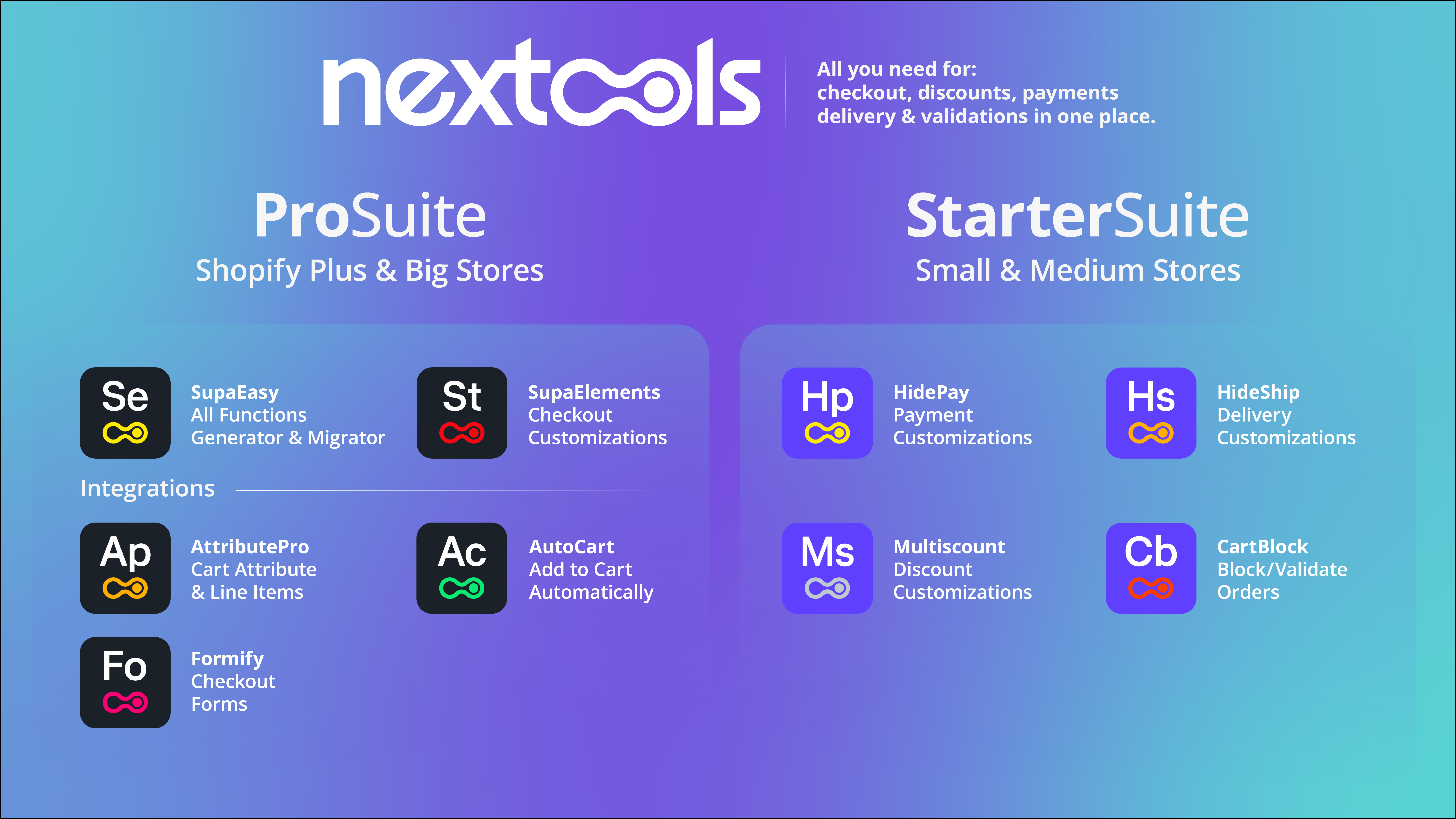
By reimagining Nextools’ design language, we tackled the challenge of growing complexity and brought clarity to the brand. The result is an identity that’s simple, innovative, and aligned with Nextools’ vision for the future—empowering all merchants, regardless of size, with tools that work effortlessly.
This rebranding marks a transformative milestone, positioning Nextools to better serve merchants and fulfill our commitment to making e-commerce accessible and intuitive for everyone.
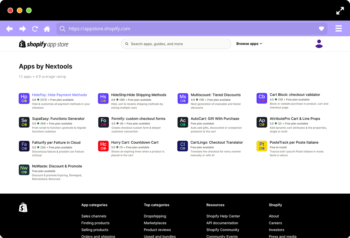
Nextools: switch to the future!
TEAM
Managing Director
Marco Venuti
Creative Director / Strategist
Michele Savino
Logo Designer
Stanislao Migliorino
Art Director
Andrea Simone
WHAT WE DID
Strategy
Branding
Art Direction
Accounting
RELATED PROJECTS →
